


用 pgfplots 繪製散佈圖
在 pgfplots axis 的 \addplot 上加上 only marks,讓資料點不連線;用 mark= 選擇形狀,資料點可以來自座標或表格。
不連線的資料點
散佈圖是只用標記繪製的系列。在 \addplot 上加上 only marks,並加上 + 以保留循環列表的顏色和標記。
兩組資料點
\begin{tikzpicture}
  \begin{axis}[xlabel={Height (m)}, ylabel={Mass (kg)}, legend pos=north west]
    \addplot+[only marks] coordinates {
      (1.62,55) (1.68,61) (1.71,66) (1.75,69) (1.80,74) (1.84,79)};
    \addplot+[only marks] coordinates {
      (1.58,49) (1.64,57) (1.69,58) (1.73,64) (1.77,68)};
    \legend{Group A, Group B}
  \end{axis}
\end{tikzpicture}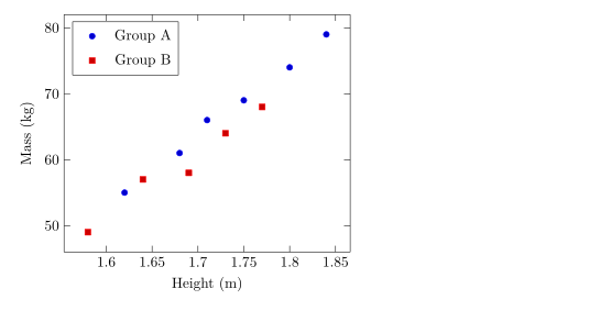
標記的形狀、大小和顏色
mark= 設定形狀,mark size= 設定半徑(預設 2pt)。實心形狀以 * 結尾。mark options 只設定標記的樣式,例如白色填色的空心標記。
不同系列使用不同標記
\begin{tikzpicture}
  \begin{axis}[enlargelimits=0.15, legend pos=outer north east]
    \addplot[only marks, mark=o, blue] coordinates {(1,2) (2,3) (3,2.5)};
    \addplot[only marks, mark=square*, red, mark size=3pt] coordinates {(1,1) (2,1.8) (3,1.2)};
    \addplot[only marks, mark=triangle*, teal, mark options={fill=white}] coordinates {(1,3) (2,4) (3,3.8)};
    \addplot[only marks, mark=x, black, mark size=4pt] coordinates {(1.5,0.5) (2.5,0.8)};
    \legend{circle, square, triangle, cross}
  \end{axis}
\end{tikzpicture}可以使用的形狀列在折線圖頁面上。
從表格讀取資料點
資料點較多時,請寫成表格。第一列為欄位命名;x= 和 y= 選擇要繪製的欄位。表格可以像這裡一樣直接寫在程式碼中,也可以放在檔案裡(請參閱從 CSV 檔案讀取資料)。
從內嵌表格讀取的資料點
\begin{tikzpicture}
  \begin{axis}[xlabel={Hours studied}, ylabel={Points}]
    \addplot[only marks, mark=*, blue!70!black] table[x=hours, y=points] {
      hours points
      2     21
      3     26
      4     30
      5     29
      6     37
      7     40
      8     44
    };
    \addplot[red, domain=2:8] {13.5 + 3.8*x};
  \end{axis}
\end{tikzpicture}
紅線是畫在資料點上方的公式,這是呈現擬合趨勢的簡單方法。
依數值為資料點上色
使用 scatter 時,每個資料點會依某個數值從色彩對應表取得顏色。point meta=y 使用 y 值;scatter src=explicit 搭配 meta= 則讀取第三個欄位。加上 colorbar 可以顯示色階。
依第三個欄位上色的資料點
\begin{tikzpicture}
  \begin{axis}[colorbar, colormap/viridis, xlabel=$x$, ylabel=$y$]
    \addplot[scatter, only marks, mark size=3pt, scatter src=explicit]
      table[x=x, y=y, meta=t] {
      x   y   t
      0.5 1.0 10
      1.0 2.2 15
      1.6 1.4 21
      2.1 3.0 28
      2.8 2.1 33
      3.3 3.6 44
    };
  \end{axis}
\end{tikzpicture}
資料點的類別
在 pgfplots 中,scatter/classes 會讓欄位中的每個類別名稱使用各自的標記。Scissor LaTeX 目前還不支援:這個選項會被忽略並顯示訊息,所有資料點都使用相同的標記。
scatter/classes:所有資料點使用同一種標記
\begin{tikzpicture}
  \begin{axis}[width=6cm, height=5cm]
    \addplot[scatter, only marks, scatter src=explicit symbolic,
             scatter/classes={a={mark=square*, blue}, b={mark=*, red}}]
      table[meta=group] {
      x y group
      1 1 a
      2 2 b
      3 1.5 a
    };
  \end{axis}
\end{tikzpicture}
「問題」分頁: pgfplots option 'scatter/classes' is not supported yet
與 TeX 安裝環境的差異
標記和散佈圖選項的完整說明請見 pgfplots 手冊:ctan.org/pkg/pgfplots。
常見問題
怎麼製作不連線的散佈圖?
在 \addplot 的選項中加上 only marks,例如 \addplot+[only marks] coordinates {...};。
怎麼改變資料點的大小?
在 \addplot 上使用 mark size=3pt。這個值是標記的半徑。
可以從 CSV 檔案繪製資料點嗎?
可以。把檔案上傳到專案中,然後寫 \addplot+[only marks] table[x=a, y=b, col sep=comma] {file.csv};。
本頁的每個範例都在建置網站時由 Scissor LaTeX 排版。 最後更新:2026-11-07